
Diamine Inkvent 2023, Day 20
The Ink
Day 20: Astral - Chameleon
Astral is a black (or very, very dark brown?) ink with green-gold chameleon shimmer. Sadly, we’ve swerved back to an ink color that I don’t like. I find black inks to be really boring, even if they have shimmer. But I know my opinion on many different ink colors have changed, so I will keep an open mind. Astral, however, is not really changing my mind at the moment.

I was having a bear of a time trying to get a picture of the shimmer against this dark background, so I used some very harsh lighting to emphasize the shimmer. It appropriately ended up looking astrophotography-like.
Last night when I washed off my writing tools, the inky water looked kind of purple-y gray, so I thought applying the ink to wet watercolor paper might bring out more purple tones. Unfortunately, it stays basically black, with some brown and perhaps very light red or pink tones. Diluting this ink in the converter would unlikely bring out much.


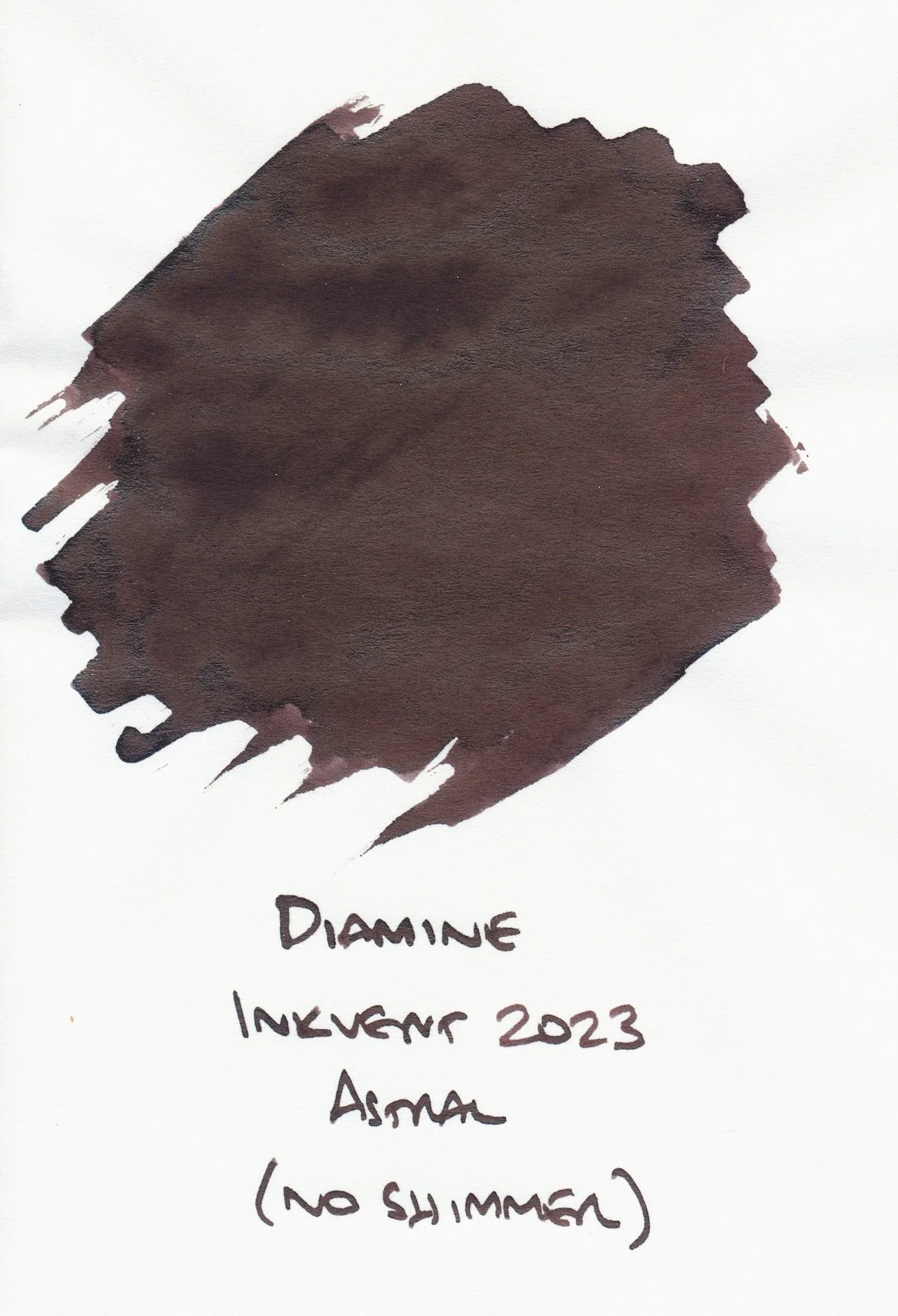
Some people have mentioned that Astral doesn’t have any sheen, but I observed some sheen on the 52gsm Tomoe River paper I use for swatching. It’s like a dark brown or black sheen which I can see more clearly on the “no shimmer” swatch.
Last year’s Solar Storm ink is similar in style to Astral, except with a very dark purple base color. The scan clearly shows the purple base, but in real life the sheen is so dark that the ink appears black to me. The chameleon shimmer also has a green-gold appearance.

I bought Ferris Wheel Press Atlas Iron Ore because it is an Atlas Stationers exclusive ink, and it was my first order from them. From the swatches, I thought I would see lots of silver shimmer, which would counteract the dark gray base, but in a pen it mainly came out as dark gray with some shimmer here and there. I perhaps need to try it in other pens, but my initial experience with it was so underwhelming that I haven’t really bothered to explore further.

As part of a set, I have a small bottle of Jacques Herbin 1670 Gris Orage. I think the bottle I have doesn’t have nearly as much shimmer as it would proportionally in a full bottle, so I don’t think I’m seeing the full coppery shimmer effect. Still, I expect that the dark gray base will often be the main visible element on the page, so I’m also not super interested in this one.

I had to buy Wearingeul’s I Am a Cat because…cat. 😺 I like this ink because it’s a lighter gray, so it doesn’t overwhelm its gold shimmer. Also, Wearingeul’s inks are quite shimmery, so they balance out the visual elements better. I think if Astral would’ve been a lighter gray instead of so bloody black, I may have liked it better.

The Quote
This dang ink was being such a pain, dripping off my dip pen nib twice, and blobbing as I wrote with it, so I dipped my Fountain Pen Revolution Tanoshii Jr. with an EF ultraflex nib (it was handy nearby) to write out the quotes from Mythic Quest’s “The 12 Hours of Christmas” episode. The team had these screens showing animations of The Masked Man crossing the screen, saying these “Christmas-themed” things periodically during their work day. I figured since I have a black ink, the quotes should reflect the mood. 😝

The Masked Man:
Ho, ho, ho! Hope is for the weak! * laughs *
Deck the halls with the bowels of your enemies!
Happy hell-idays! * laughs *
On Slasher, on Smasher, on Basher, and Sick One. Scary Christmas to all, and to all a good fright!