
Favorite Fountain Pens for February
I thought I’d do a round-up of the fountain pens I liked using the most for February. I had ~23 pens inked up last month, and 10 of them were favorites or runners up, a pretty good percentage.
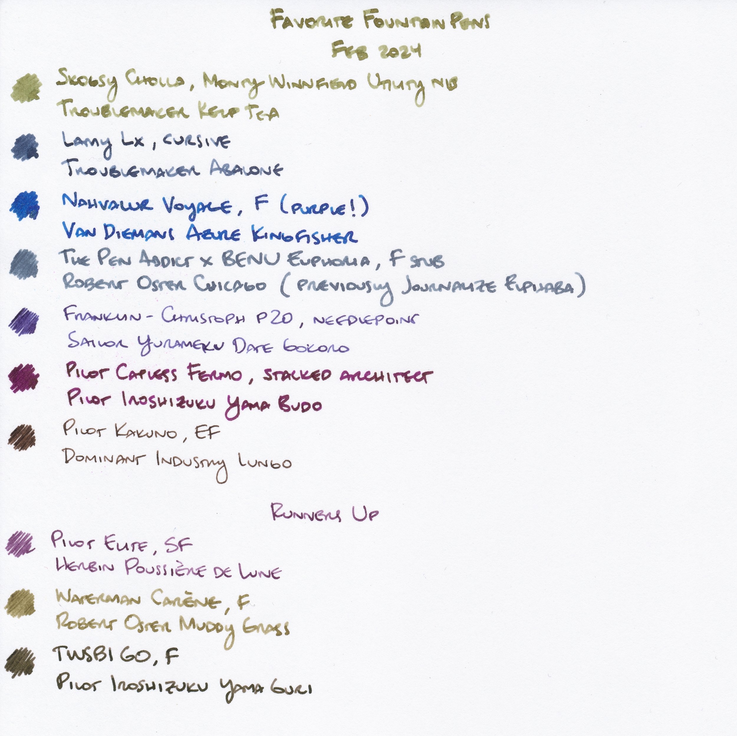
The List
Favorite Fountain Pens, February 2024
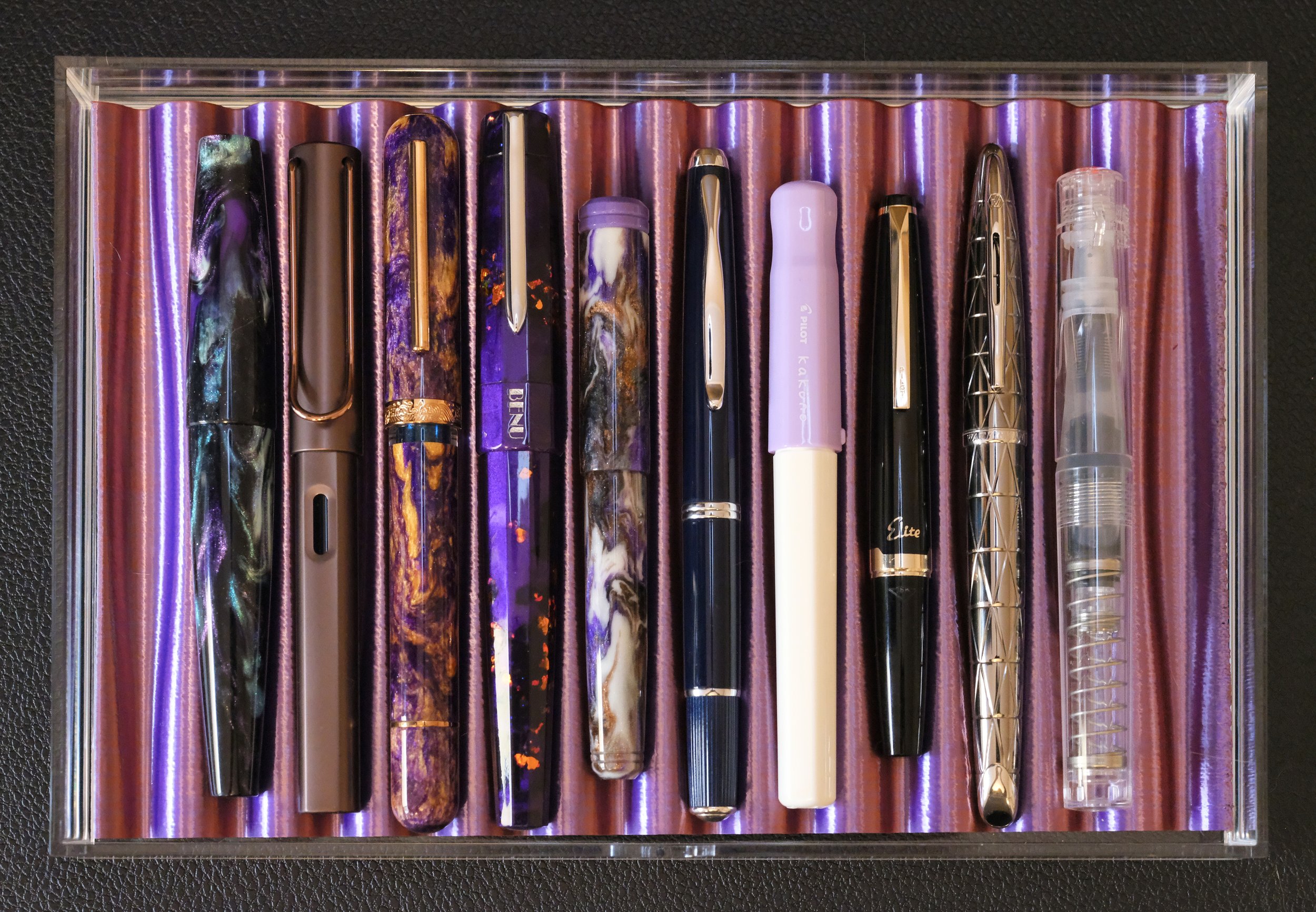
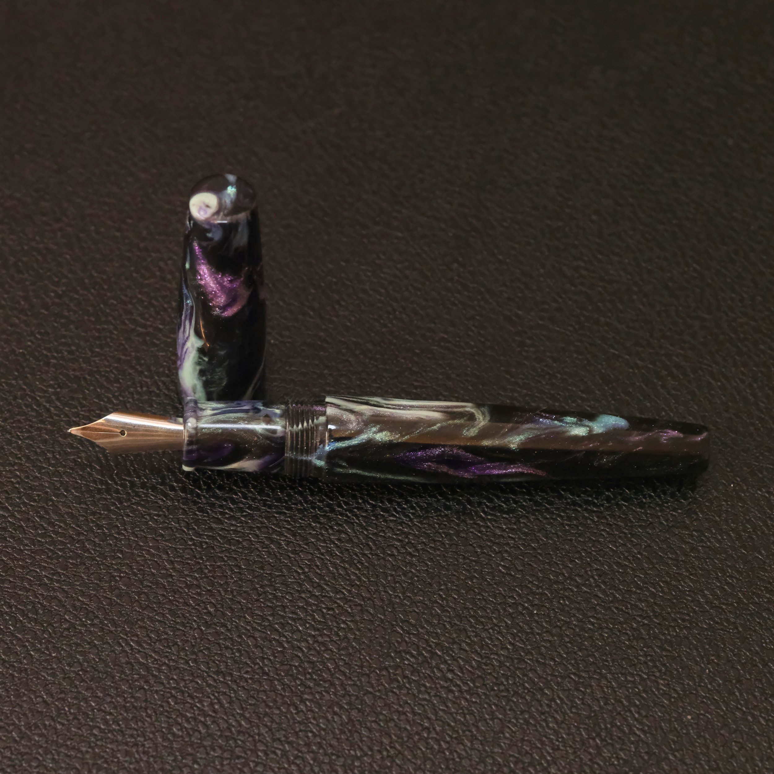
Skogsy (Pens) Cholla, Monty Winnfield Utility nib, Troublemaker Kelp Tea
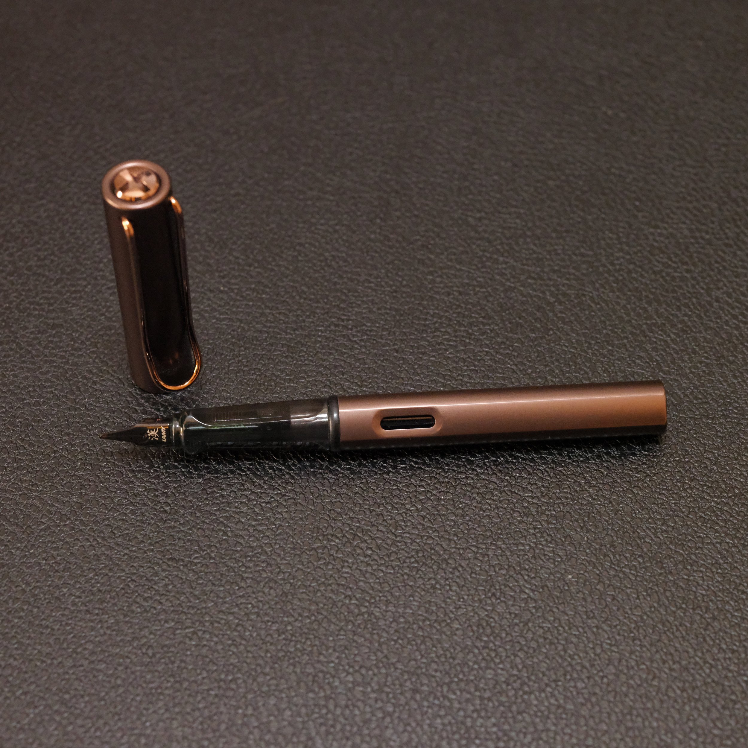
Lamy Lx, cursive, Troublemaker Abalone
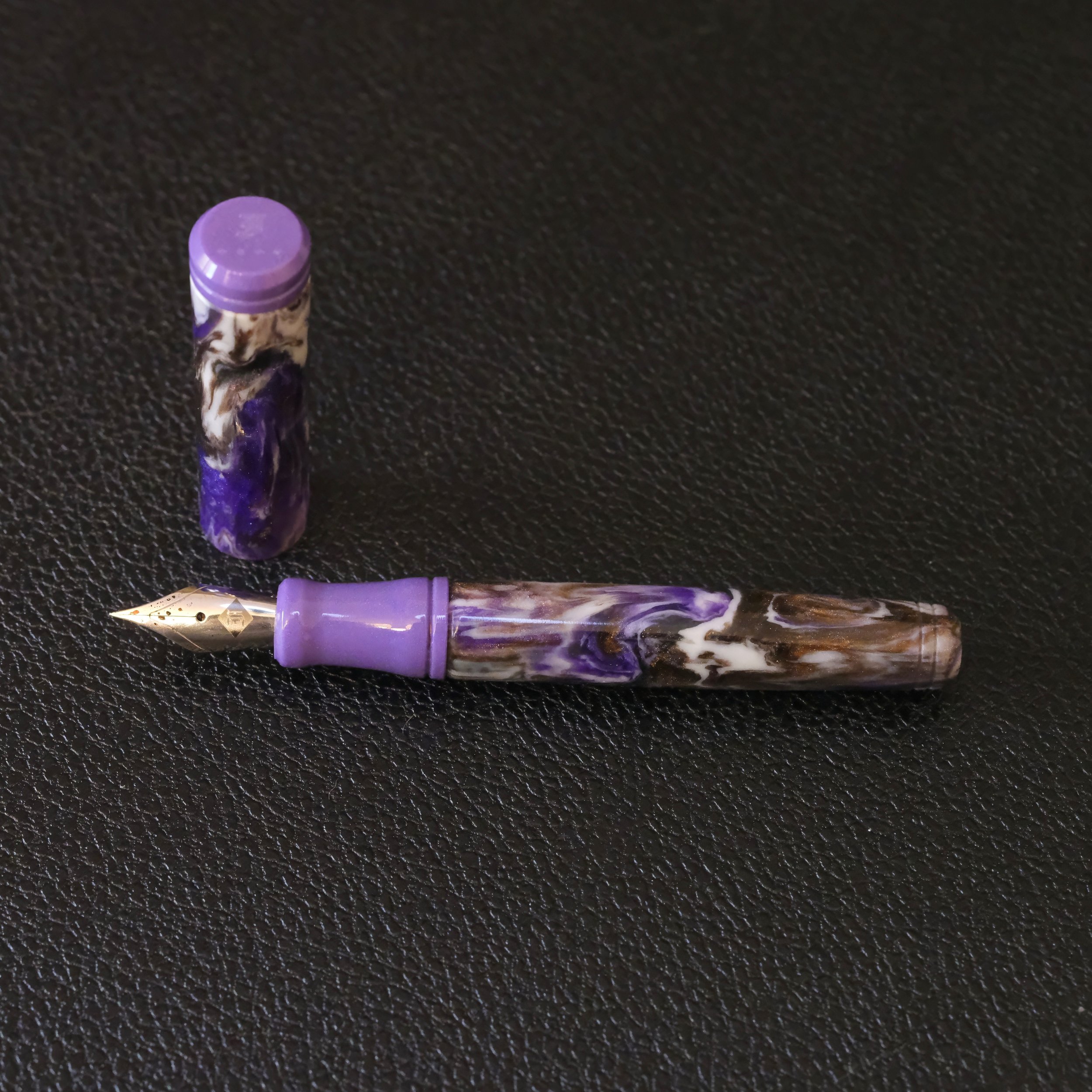
Nahvalur Voyage, F (purple!), Van Diemans Azure Kingfisher
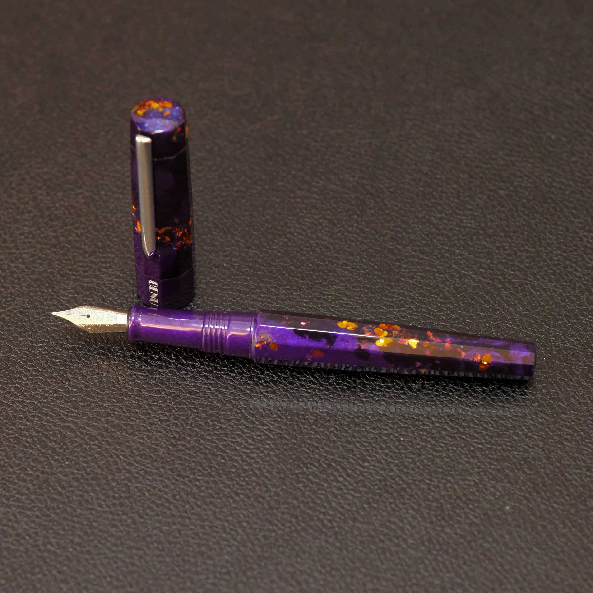
The Pen Addict x BENU Euphoria, F stub, Robert Oster Chicago (previously Journalize Elphaba)
Franklin-Christoph p20, needlepoint, Sailor Yurameku Date Gokoro
Pilot Capless Fermo, stacked architect, Pilot Iroshizuku Yama Budo
Pilot Kakuno, EF, Dominant Industry Lungo
Runners Up
Pilot Elite, SF, Herbin Poussière de Lune
Waterman Carène, F, Robert Oster Muddy Grass
TWSBI GO, F, Pilot Iroshizuku Yama Guri
5 of the list of 10 have special nib grinds, whether they were custom from a maker, or could be bought from the manufacturer. Slightly surprising was the balance of custom nibs with “stock” nibs. I thought that once I got into special nibs, the regular nibs would be too boring, but I think having great inks paired with regular nibs helps make them write well and still feel special.
A big theme in this bunch of favorites was how well I liked the inks paired with each pen. This seems like a “duh” moment, but sometimes I use a pen-ink pairing and it’s fine. Not special enough to marvel at it, but not bad enough to make me want to switch it out. It just is. Anyway, for these favorities, in some cases, the pairing resulted in great ink flow. In other cases, I loved how the ink was “rendered” by the nib, whether the ink had lovely shading or awesomely distributed shimmer. And sometimes it wasn’t necessarily the pen/nib that I really liked, but the ink itself.
Let Me Explain
The easiest grouping to explain is the pens where I mainly liked the inks, but the nibs weren’t really that special. The TWSBI GO and Waterman Carène were the two pens in this category.


Don’t get me wrong, the Carène is a special pen overall, but its fine nib is kind of ordinary. I got a stub nib for it a while ago, but it wrote too broadly for my small-grid Hobonichi Hon, so I switched back to the regular fine nib it came with. I would consider getting this fine nib reground to something more special to match the pen.
The next grouping is where the nib and ink combo felt really great to write with and had awesome flow. Technically, I could’ve said this of the remaining 8 pens. But I particularly loved the nib and ink combo for its feel in the Pilot Elite soft fine (what a great bouncy nib), the Lamy Lx cursive (an awesome “sleeper” nib that you can buy straight from Lamy for a reasonable price), and squeaking onto the list was the Pilot Capless Fermo with the custom stacked architect nib I bought from a maker on Instagram, Sallymander Nibs (I will blog about this separately).


I say the stacked nib “squeaked onto the list” because the Pilot Iroshizuku ink flows so wet that I have to hold the pen at a higher angle to avoid so much ink pooling and the sheen taking over the base color (I don’t like the overwhelming gold sheen; in reality looks like a bad brown and magenta mix in my small handwriting). But the nib performs so well that I kept it in this group.
The final grouping was where not only did I love the ink and nib combo, but the ink looked particularly nice flowing from the nib it was paired with. The Monty Winnfield Utility nib, which is a reverse architect, has a great italic EF on the regular side, and a sharp, broad architect on the reverse. The EF showed off the shading in Troublemaker Kelp Tea, but the reverse side can offer a brush-like quality to my writing, and Kelp Tea’s chromoshading was emphasized by it, especially on Tomoe River paper. If I had to choose only one pen to use for an extended period of time, I wouldn’t mind using this combo.
The Nahvalur Voyage’s nib has a purple color to counteract the “boring” fine nib, but additionally, the Van Diemans Azure Kingfisher ink, which has lovely shimmer and sheen, flows exceptionally well from this nib. It feels quite smooth, and even if I only gave the pen a little shake, the shimmer remained well-distributed throughout my writing, with bits of sheeny outlining. I am not sure if Azure Kingfisher works as well in other pens, but I totally loved it here.

I had a similar feeling with the BENU and The Pen Addict collaboration Euphoria when it was filled earlier in February with Journalize Elphaba. That ink had a great base color and shimmer that was surprisingly well-behaved in the Euphoria’s fine stub nib for a long time. But nearing the end of February, I had to refill with a different ink. The current pairing with the Robert Oster ink looks nice and works well in the fine stub, but it’s not quite as special of a combo as the Journalize ink was.
And finally, the two needlepointy nibs from Franklin-Christoph and Pilot are so fine, you wouldn’t think that you could distinguish any ink characteristics from such little ink flow, but you can! Both super-fine nibs show off shading, which I was pleasantly surprised by.
Before the Franklin-Christoph I did not know what to expect from a needlepoint nib. I was concerned it might be too scratchy, but it isn’t at all. And it actually reminded me of my finer Pilot Elite nibs (also EF or F), so when I read recently that a Kakuno EF is desirably super-fine, I was keen to try one, and am happy I finally did.
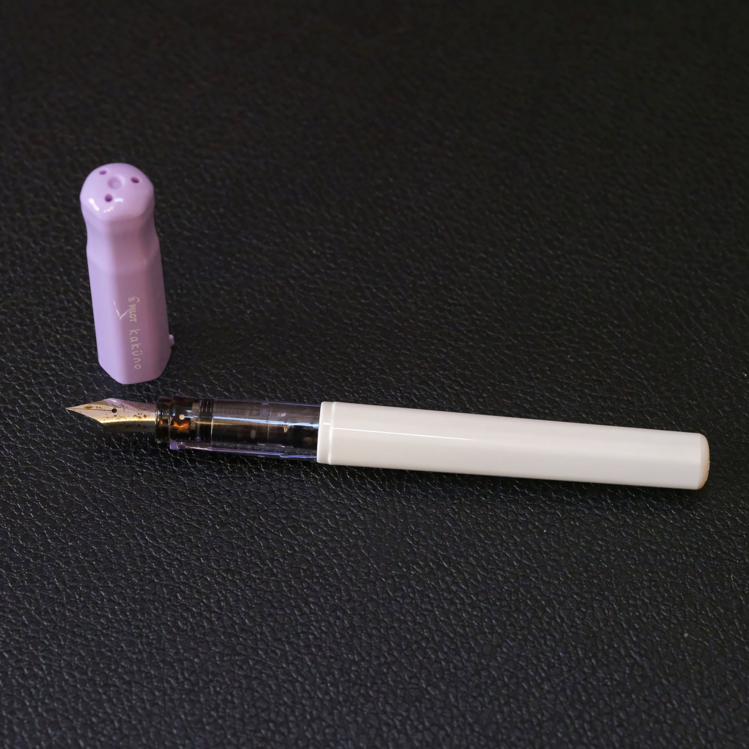
It’s finer than the F-C needlepoint and has more of the “pointy nib” feedback that I thought the needlepoint would have. But the feedback is pleasant to me. It makes me feel like I’m using a very precise writing tool, and I enjoy how neat my writing looks, even when it isn’t neat. 🙂 I’m very curious to try a shimmer ink in the Kakuno, but I am somewhat sure that it’ll result in some clogging. I just want to try it anyway and remove any doubts. 😅
Anyway, I was really happy with these pens in February. I cleaned out many of my currently inked over the weekend for March’s batch of pens, and all of these pens remain, though some of them did get an ink change. I’ll post that list separately, since this post is already way too long. 😆