
Franklin-Christoph Philly Pen Show 2024 Ink - Indigo
I didn’t go to the Philly Pen Show, but I saw that Franklin-Christoph put their pen show ink on their site, so I decided to get a bottle. I also picked up an extra-fine flex nib, but I’ll post about that separately.
The ink bottles are 1 ounce (~30 mL) glass bottles. Pretty nice width for easy filling.
I appreciate this domed plastic seal inside, which cuts down on mess from ink clinging to the lid. I was kinda scared the ink would get to me leaking from being frozen, but luckily no such mess occurred. Being out in California, I forget that the Midwest and East coasts are dealing with freezing temps still.
The ink is called Indigo. When I heard that, I thought it might be a blurple (because of where it sits in a rainbow spectrum), or some kind of a dusky blue. In reality, it looks more like a medium gray with some bluish and super subtle purple tones. This scan of the ink brings out more of the purple tones than actually appear to my eye in most writing situations. It’s more of a slightly bluish gray to me.
In this ink swatch, the long blade nib I’m using shows off some shading, but the since the ink flows pretty wet, you might not see much shading depending on your nib width.
Looking at the close up of the ink clinging to the bottle, you can see more of a blurple/indigo color, which is how I would’ve preferred the ink to show up as on paper.

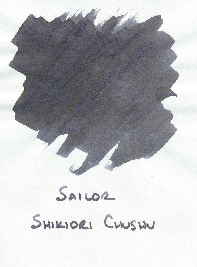
The two closest inks I have in my collection are Diamine Earl Grey and Sailor Shikiori Chushu. Since I’m not nearly through either bottle, I’m going to have plenty of this medium gray ink for a long time. 😛
I mentioned before that I got an extra-fine flex nib from Franklin-Christoph, which I put in my Kasama Una Takipsilim (the vibrant Ultem pen with the gradient paint job). The ink was very wet so it really didn’t show much shading or the blue or purple tones present in the swatch. I never like to ink up multiple pens with the same ink (boring), but I was curious to find a nib that would bring out more blue and more shading. The 4 pens below are my sample set.
From left to right:
Jinhao X159 with a #8 fine nib
Kasama Una with a Franklin-Christoph EF flex nib
Lamy Lx with a Lamy cursive nib
The Good Blue L130 with a zoom nib
The EF flex nib is definitely finer than all of the other nibs, but the ink flows very wet, so I need a light touch to keep the line width EF.
The Lamy cursive nib was also pretty wet, so it’s the darkest and broadest writing sample.
Surprisingly, the L130’s zoom nib is on the dry side, so it allows more of the shading and blue tones come through in writing (but not a lot).
The Jinhao’s fine (which writes more like a medium to my eye) nib is a good runner-up to the L130’s zoom nib as far as showing shading and blue tones.
It looks like The Good Blue’s L130 is the best pairing with this ink, given my preferences. I’ll probably switch out the ink in the other pens.
What do you think of this ink? Given its name, do you wish, like me, that its color were more blue/purple? It seems well-behaved enough, but since I have a couple other grays that are very similar, it’s an underwhelming addition to my collection. 🤷♀️